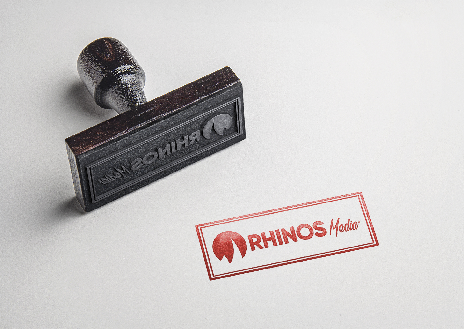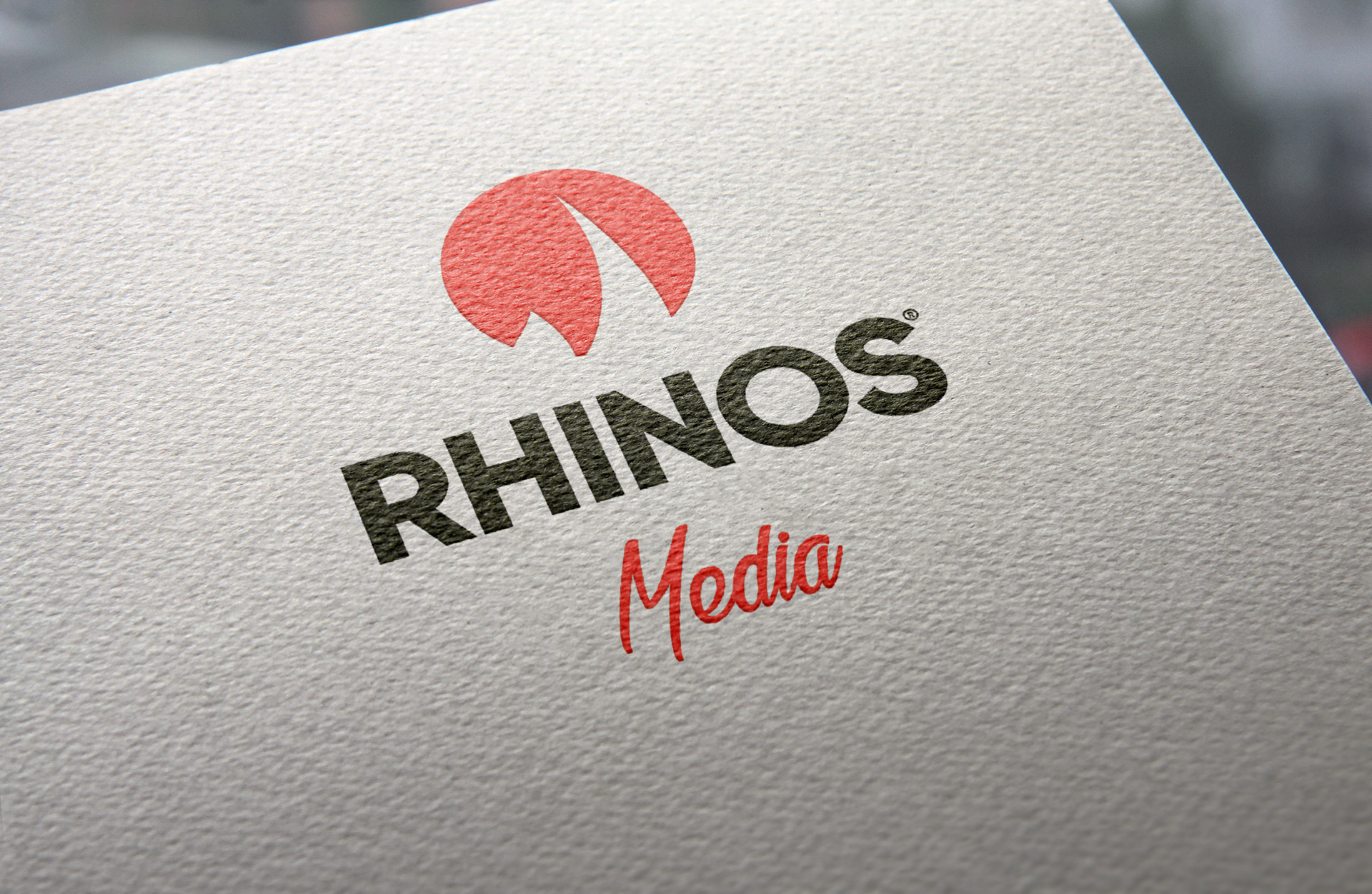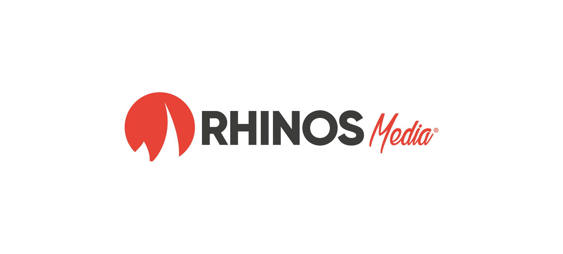
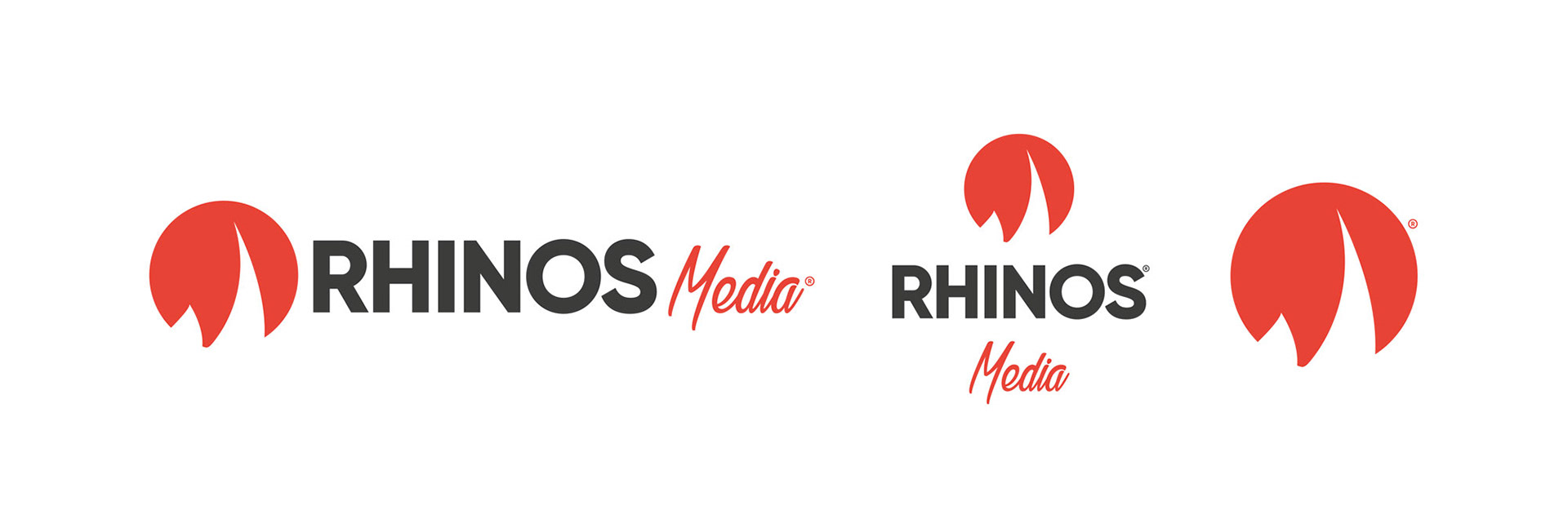
Rhinos Media new logo
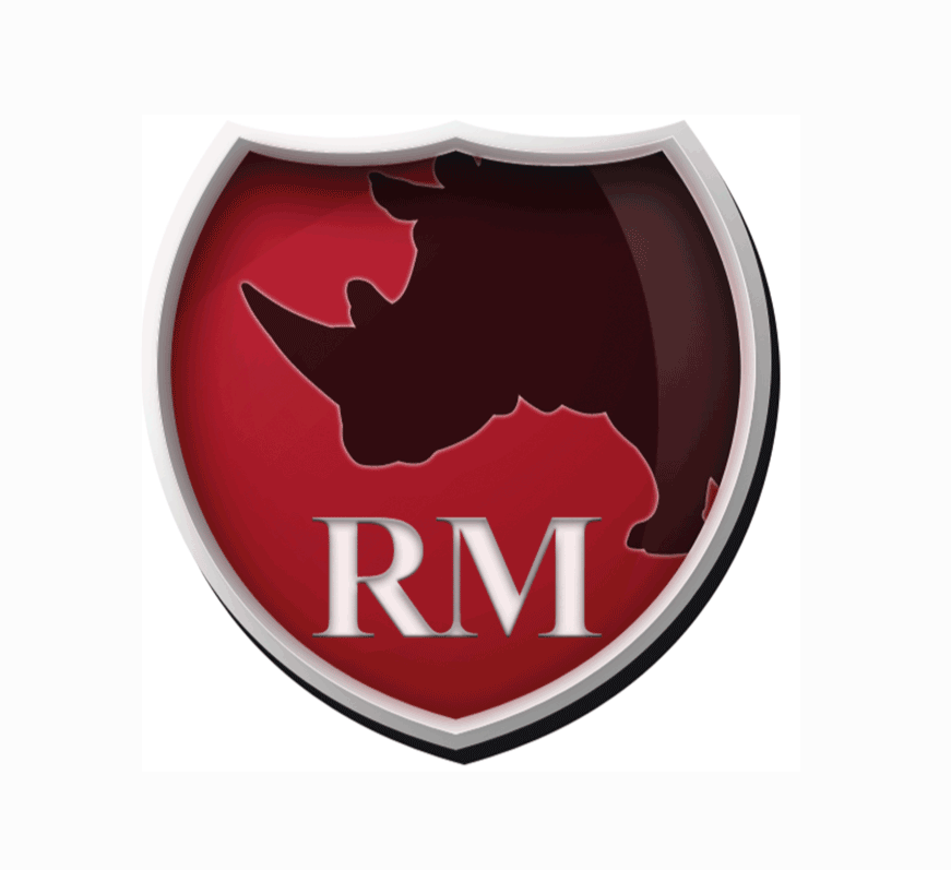
The old symbol of Rhinos Media
Rhinos Media old logo
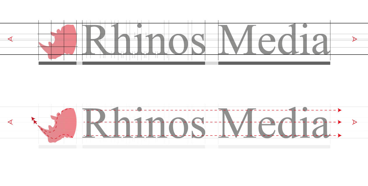
Directions lead the eye
I would usually start with analyzing the existed logo to know what does work and what not.
In this case the logo contained a visual conflict. The Rhinos head has curves and shows from left to right while the text has straight lines and shows from right to the left.
Optical mass
The old logo has an inconsistent bulk which confuses the eye. I drew the mass underneath the logo to see how does that affect the over all lock and feel of the logo. Even the letters has different height and bulk through small and capital letters.
The Rhinos head looks awkward too as if it cut out with a large amount of area without details, just sets there insignificant.
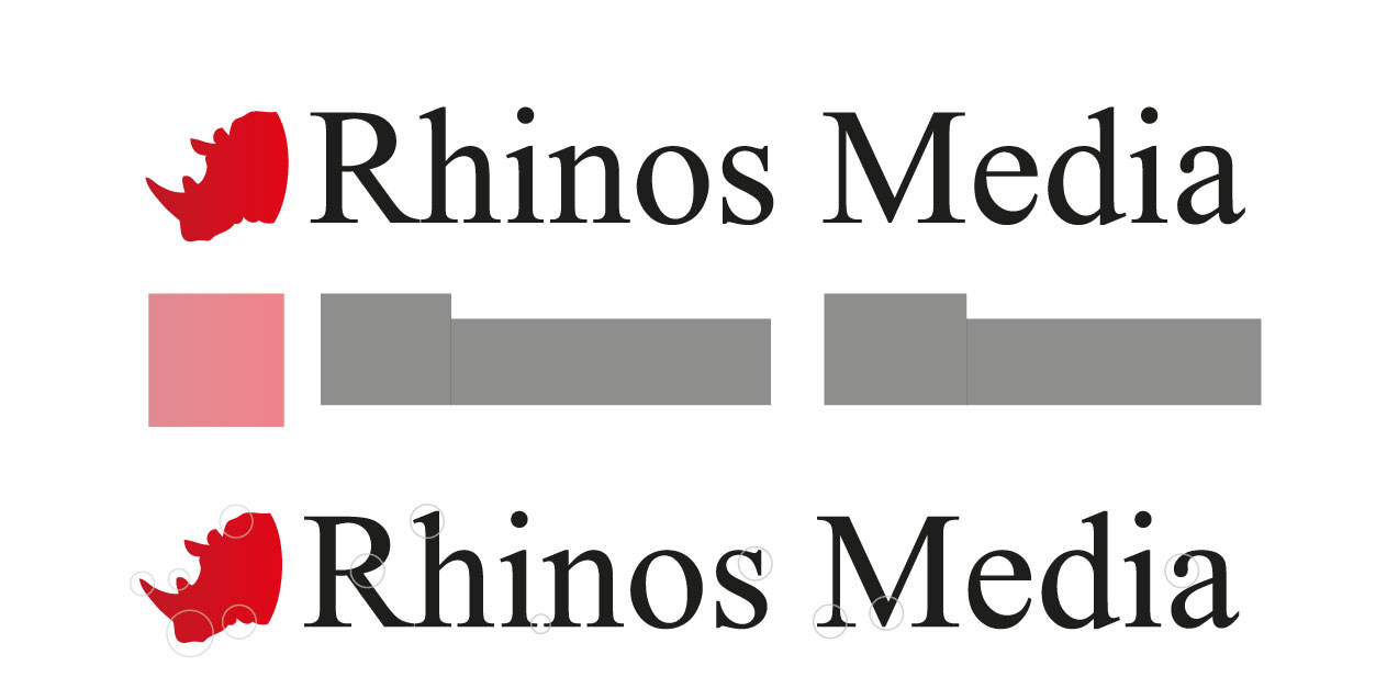
Rounded Edges
Next I became aware of the edges of the symbol and the letters. The Rhinos head has curvy rounded edges while the letters had sharp square edges which make the overall image pretty confusing as if they do not belong together.
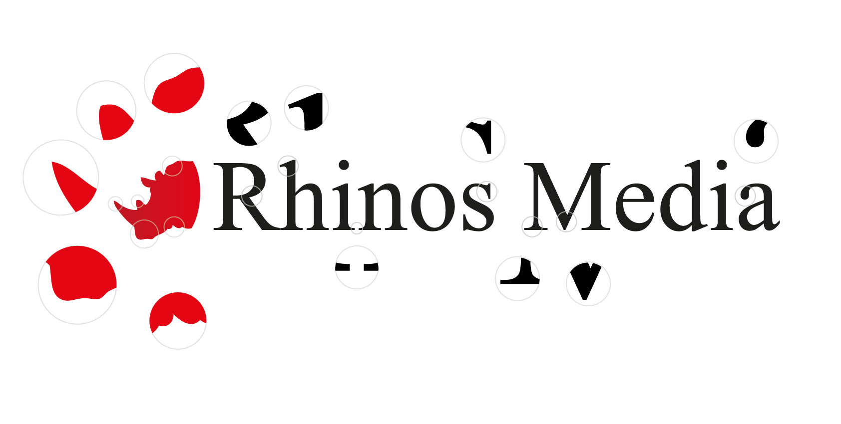
First Solution
First I flipped the head to match the letters direction and change the font to match the edges of the Rhinos. To make the symbol significant I placed it into a huge circle as a negative space to avoid looking cuted. This way it makes the illusion that the Rhinos body there but visible. Another benefit of this solution is that the symbol now strong enough and could be used on its own. It a lot better, but not perfect yet!
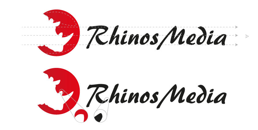
Final Destination
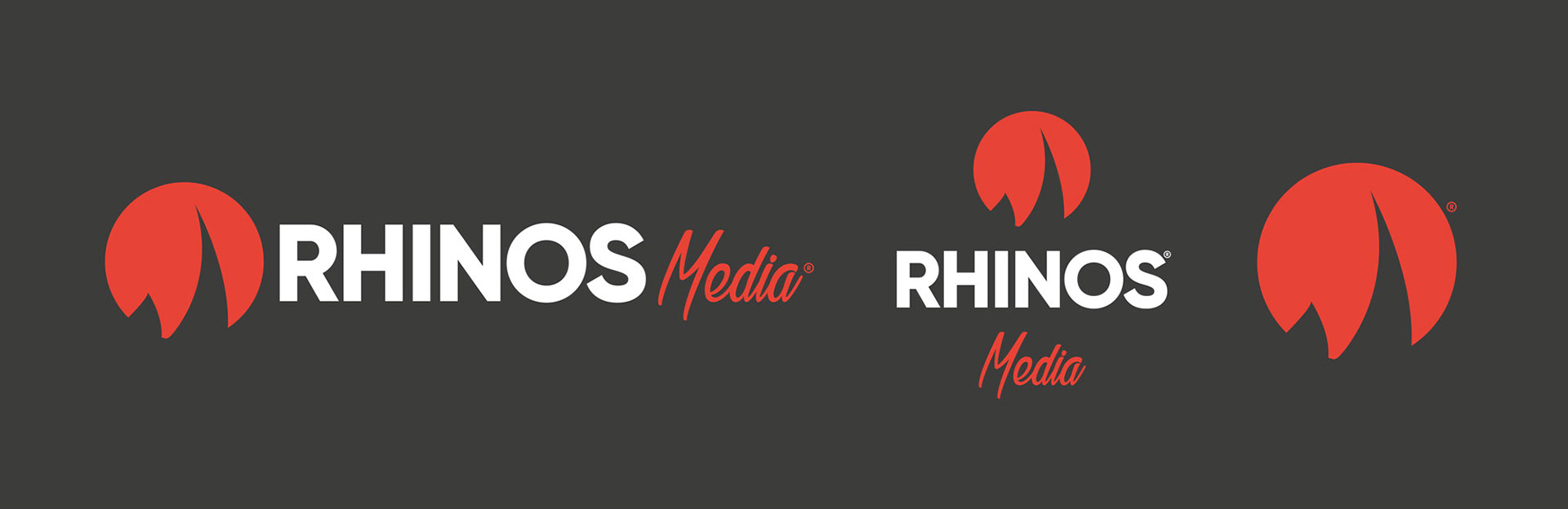
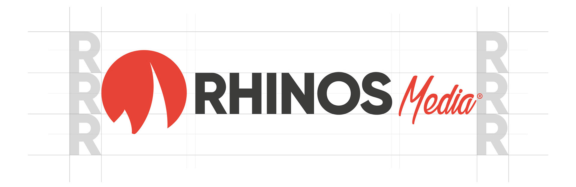
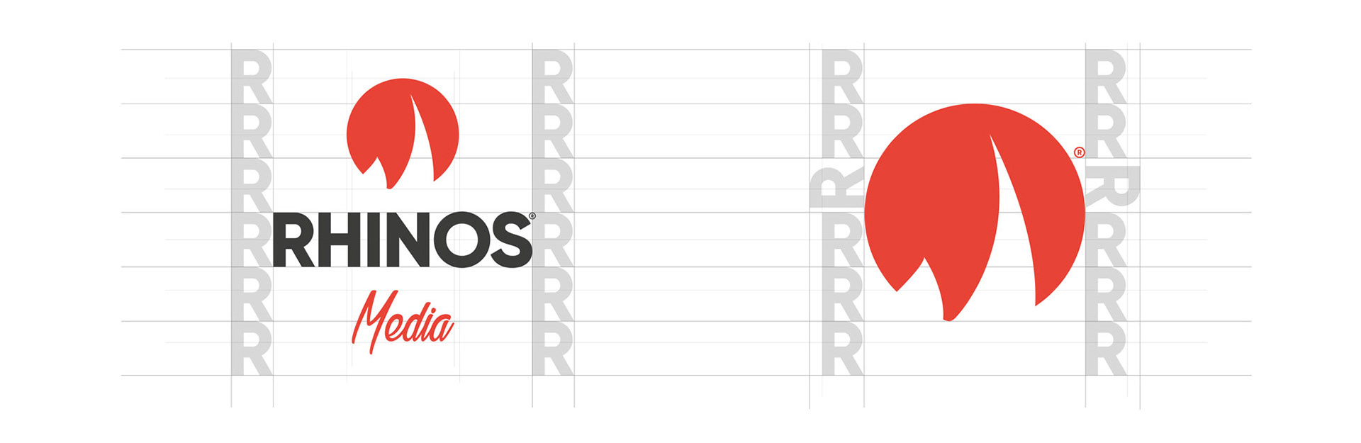
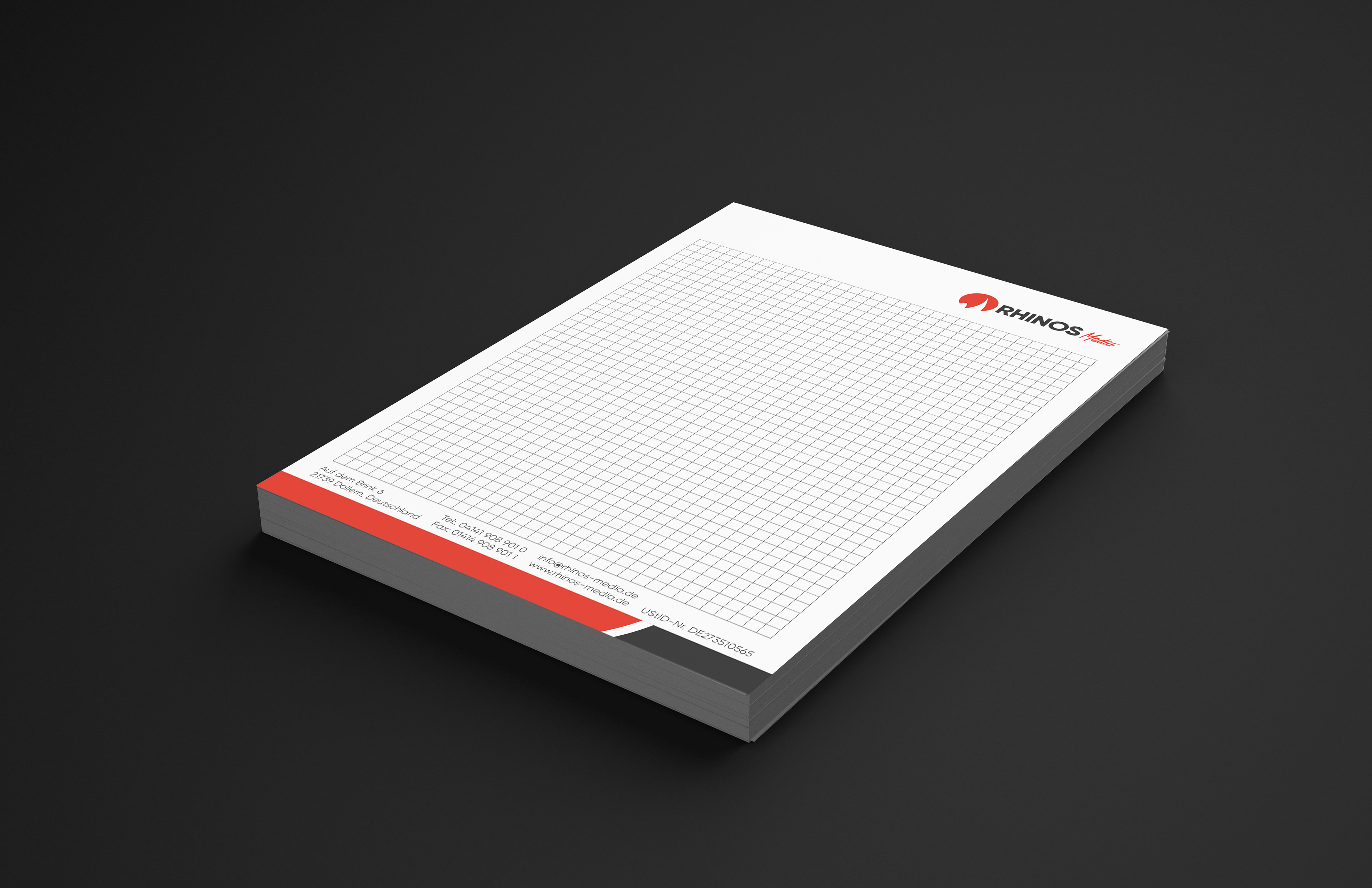
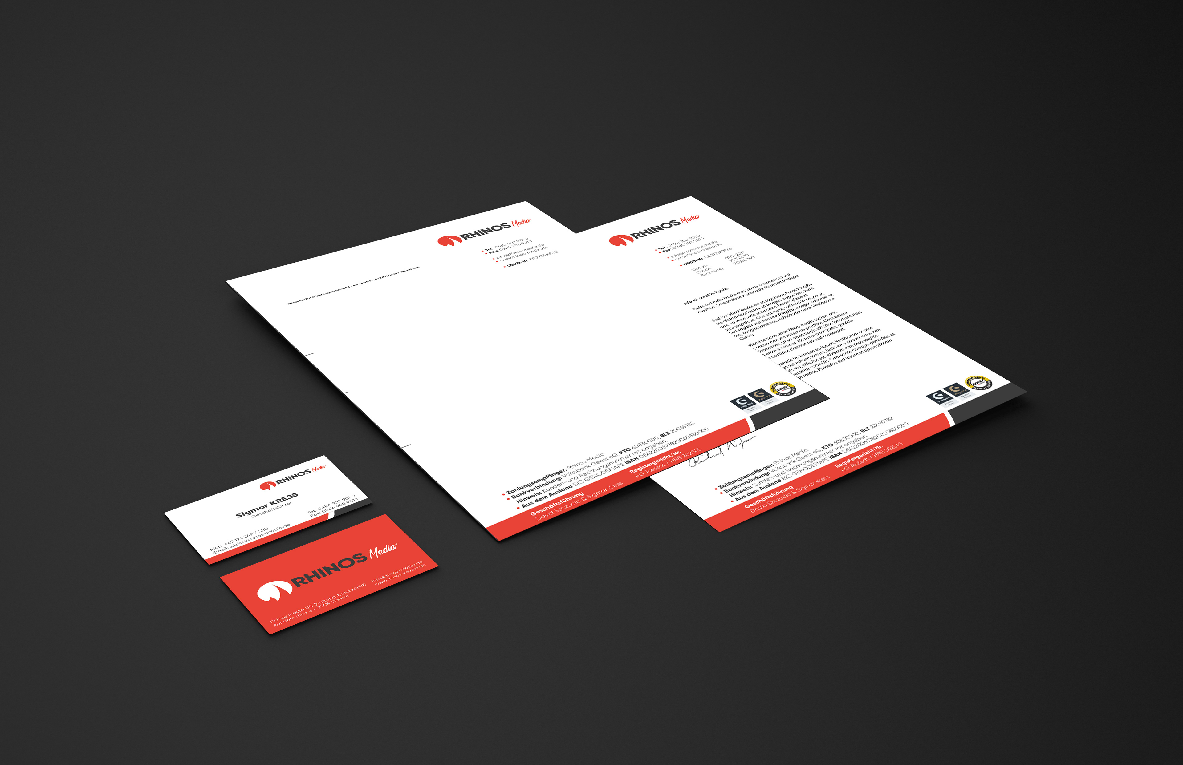
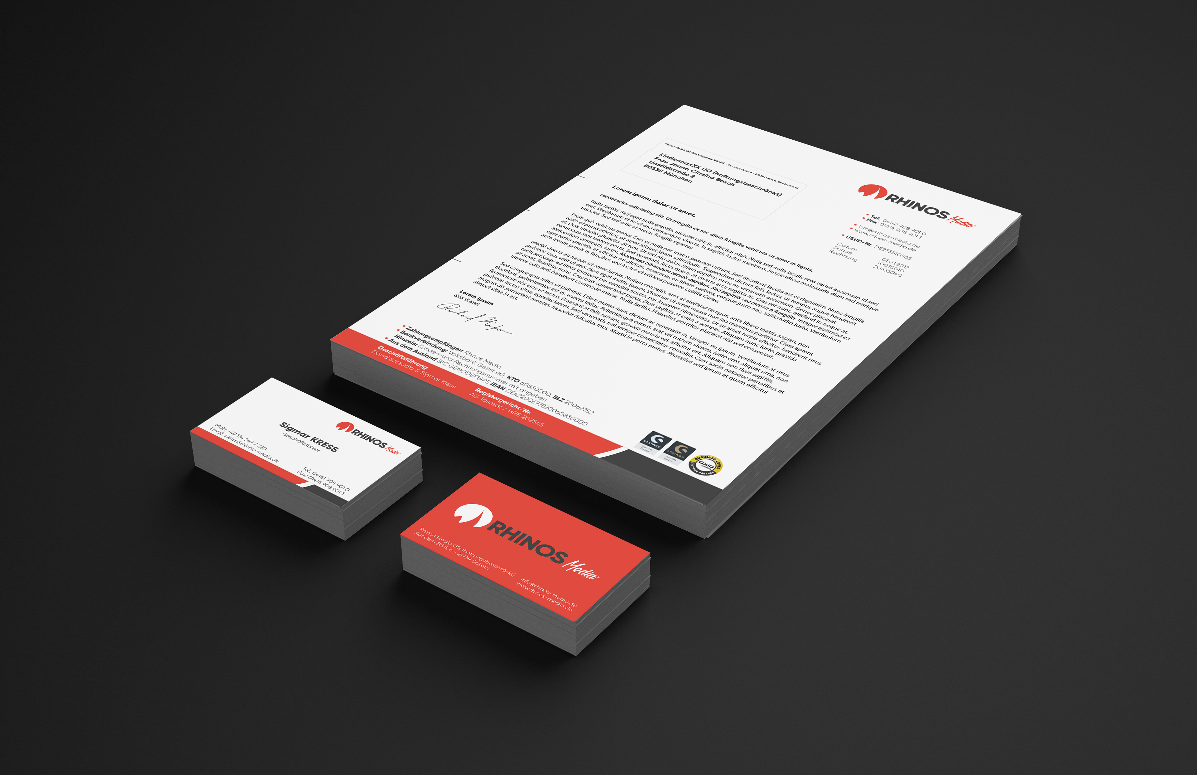
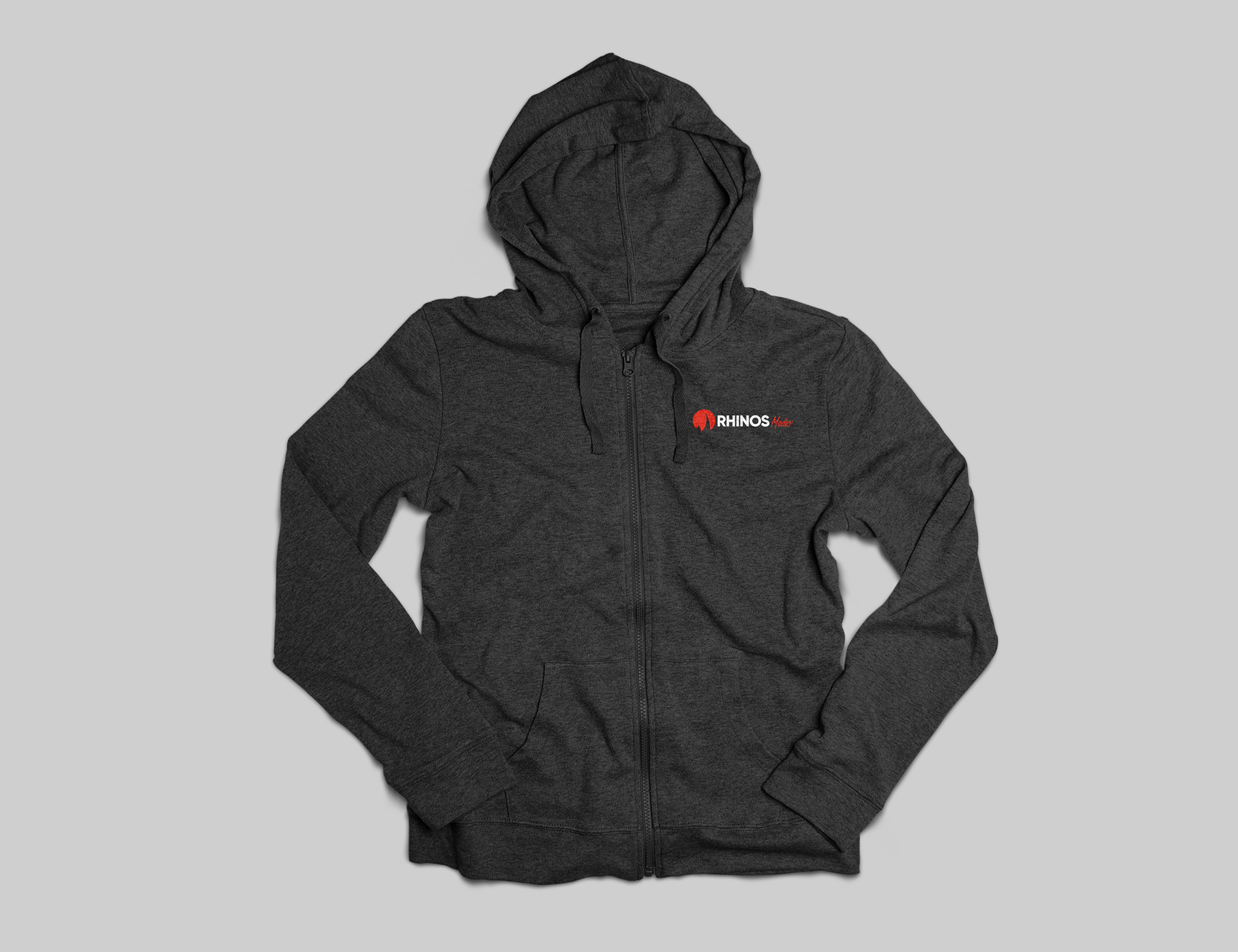
The last version was busy and the details are all over the place. In order to make it clean I had to take many details away. So I kept only the horn of the Rhinos to reinforce the symbolic of the image. I change the font for the last time. Gilroy is bold, stable and modern font which made the case here. Also, the “O” letter resembles the perfect cycle of the symbol which now match the edges of the letters. The final logo could be used in three different ways depend on the situation: vertical, horizontal and only the symbol.
Not only the shape has changed, but also the color. although I kept the original pallet of red, black and white, I shifted it a little toward flat color to keep it up with the modernity.