THE MISSION
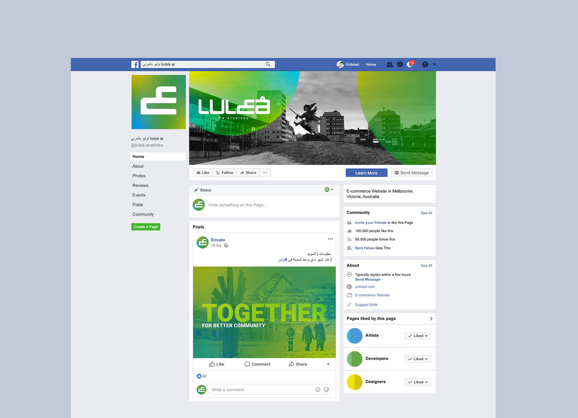
Design a logo for "Luleå in arabic" which is an online community foucused on the arabs in Sweden, espicially in Luleå. With the potential of being someday an organisation on the ground, not only virtual existence. Reflecting professional manner in a simple and claer way, also cummnicate the essence and the core value. Also providing some graphic elements such as facebook cover.
Design a logo for "Luleå in arabic" which is an online community foucused on the arabs in Sweden, espicially in Luleå. With the potential of being someday an organisation on the ground, not only virtual existence. Reflecting professional manner in a simple and claer way, also cummnicate the essence and the core value. Also providing some graphic elements such as facebook cover.
THE TARGET AUDIENCE
It aimes mainly to provide the arabic residents of Luleå area, Regardless of gender and different age groups, with useful informations and recent news to help them stay aware of thire envoirnment, facilitate the daily needs and enable thier self dependent. By targiting the swedish population partly, it emphasizes and empowers the coexistence. The target audience includs everyone who intrested in Luleås news.
It aimes mainly to provide the arabic residents of Luleå area, Regardless of gender and different age groups, with useful informations and recent news to help them stay aware of thire envoirnment, facilitate the daily needs and enable thier self dependent. By targiting the swedish population partly, it emphasizes and empowers the coexistence. The target audience includs everyone who intrested in Luleås news.
THE CONCEPT
The Arabs are a relativ new component in the swedish community. So these are two things need to be considered: the swedesh community and the arabs as an integrated part of it. The key concept is to craft a logo holds these two compenents.
The Arabs are a relativ new component in the swedish community. So these are two things need to be considered: the swedesh community and the arabs as an integrated part of it. The key concept is to craft a logo holds these two compenents.
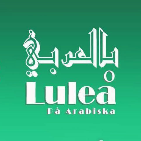
Old logo
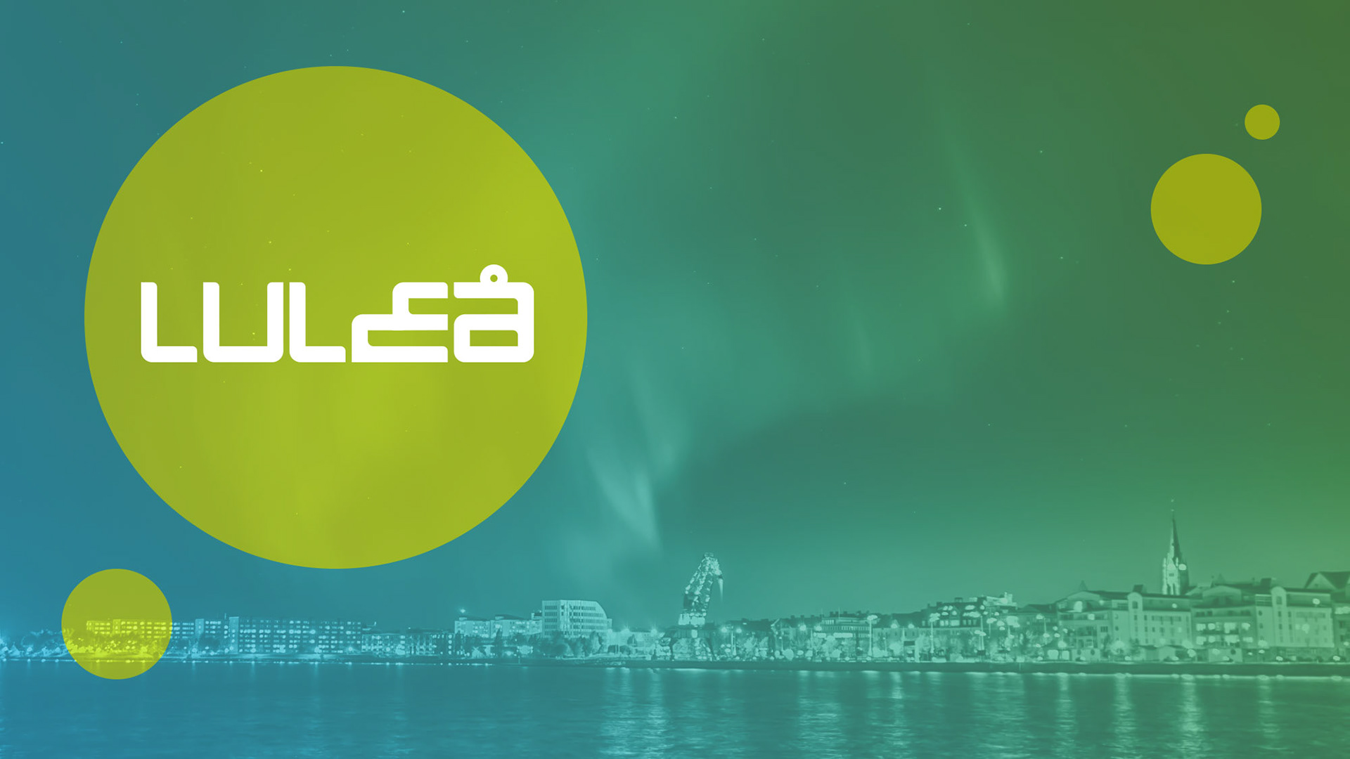
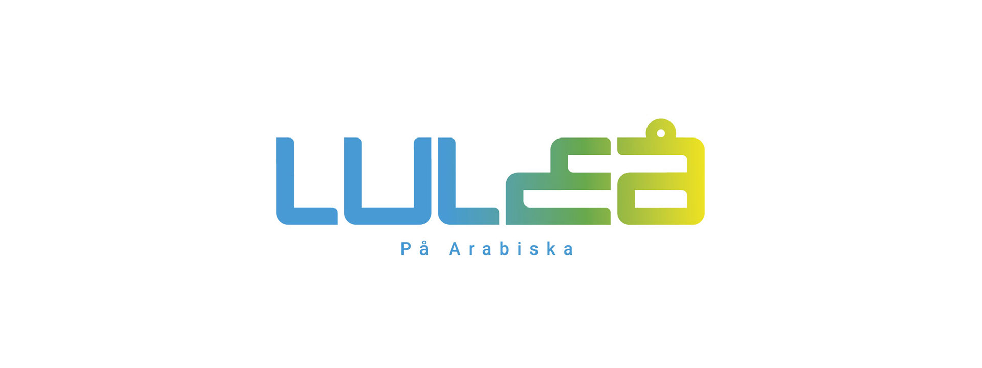
CUSTOMIZED TYPEFACE
The idea is to represent Luleå in a similar way it presented, so the observer recog - nises it quickly and make him thinks about Luleå – the City, yet it’s different enough to distinguish it from the original logo.
ARABIC TOUCH
The most common used symbole of the arabic language is the letter “ whitch” ع is the first letter of the word ‘Arabic’. So I turned the letter “E” into the letter “ to” ع express that the arabs in Luleå are a part of the society as the arabic letter a part of the sweedish word.
DIRECT SELECTION
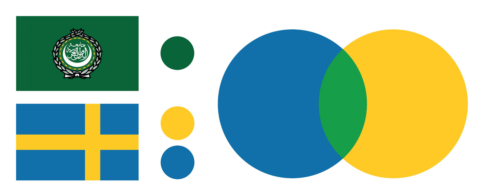
The idea is based on merging, joining and integrating two different ingredient. the same principle applys here to fi nd the color which able to refl ect both identities. Swedesh fl ag represents the swedesh socity and the Arab League fl ag represents the arabic language and culture. we also would get the green colour from mixing the the yellow with the blue, but it's not perfect yet.
THE PERFECT BALANCE
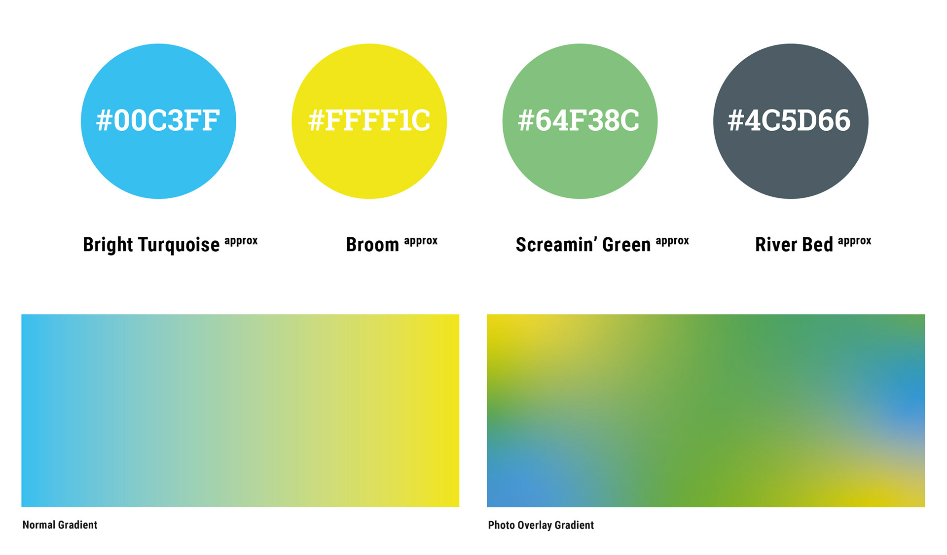
The original selection was harsh and dose not reflect the desired look-and-feel. So the color palette could use some twicking to modernize it a littel bit. By shifting the hue toward light colors results modern, clear and positive feeling color palette . Also using gradient to emphsize the relationship and the integration.
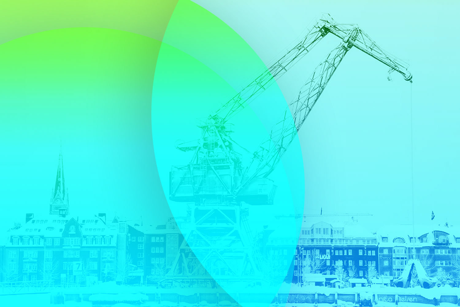
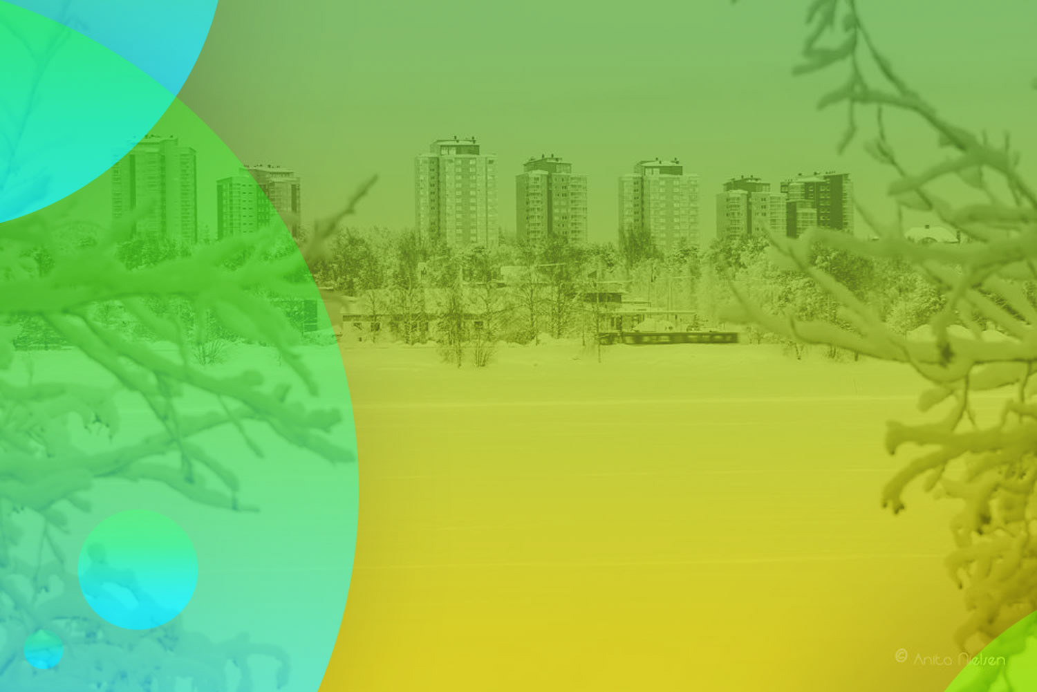
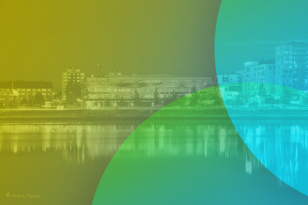
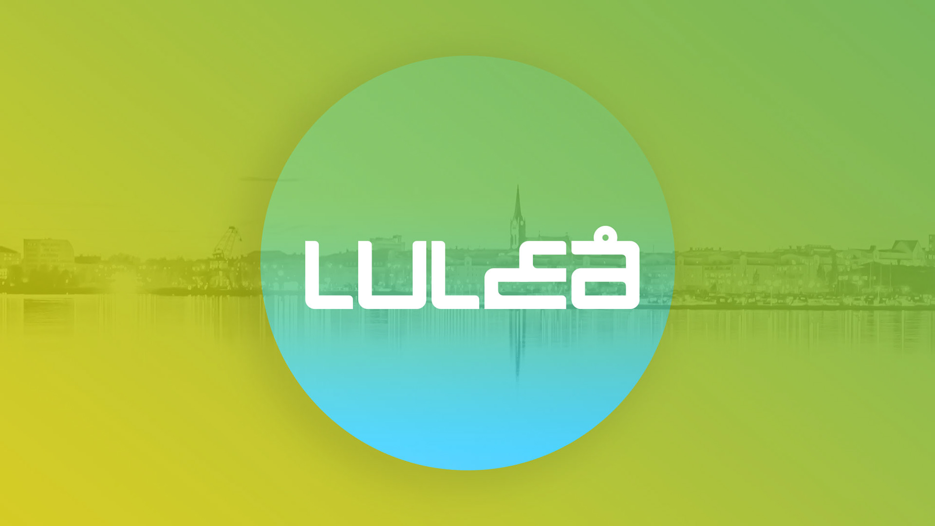
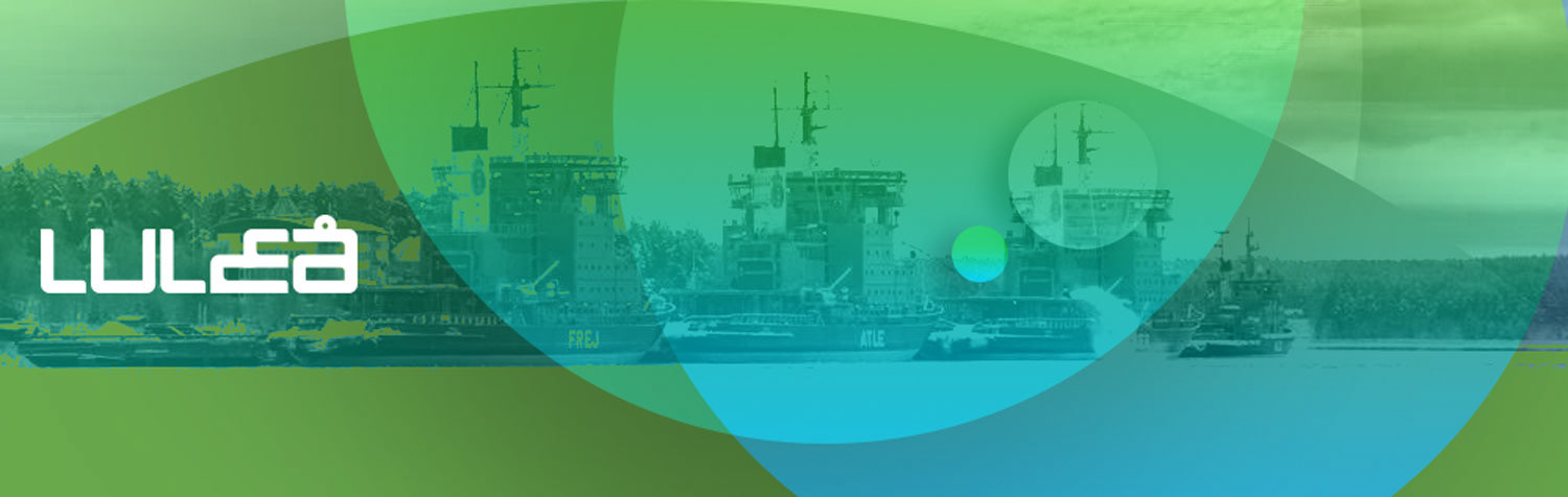
LULEÅ UNIQUE LOOK
The image of "Luleå in arabic" like facebook cover, flyer, poster or another iteme well be presented in such way with overlay gradient to give the photo vivid color which also act beside the logo like a unique identifier.