Old Logo
The Mission
During my work in Master Design agency, Jafra foundation had contacted me asking to redo the Logo, but they wanted to keep the old logo cause it has been the organization face since the founding. So I had to enhance the existed logo and create new way to present Jafra visually mainly on the social media.
Analysis & Realization
First I did an analysis and break the logo down. I found the symbol pretty, but I could not live with random alignment and colorlessness. Next I vectorized the logo and center the text underneath.
I added the Arabic name to the logo to create more balance and to make it visually pleasing. The lettering matches the two words, the Arabic and the English one.
It is a relief foundation and it is about development, so I chose the light green color to reflect that and balanced it with dark green to get reasonable contrast and drew attention more to words than the faces.
The new Logo in full color
The new Logo monochrome
Logo usage
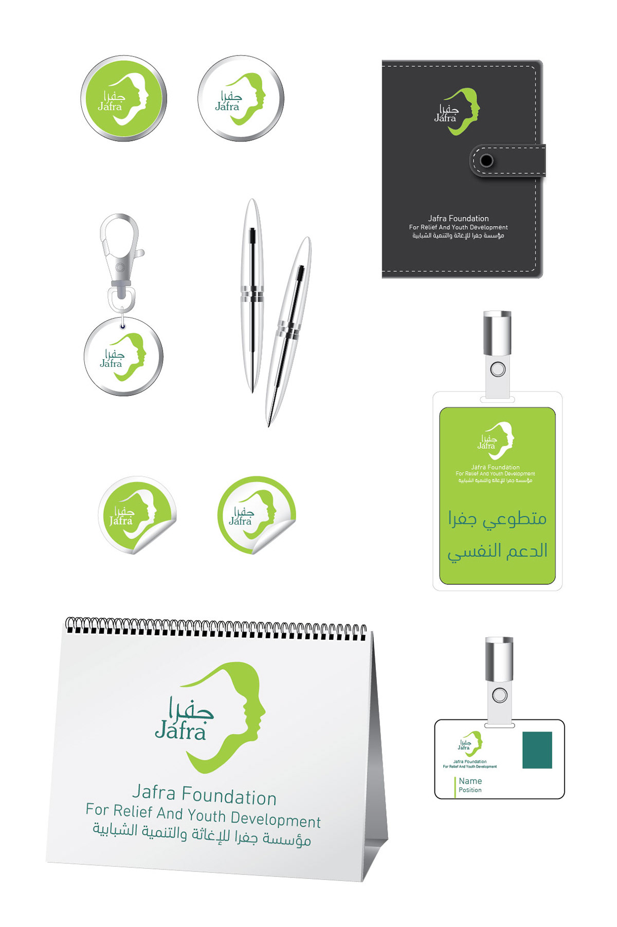
Print and promotional items
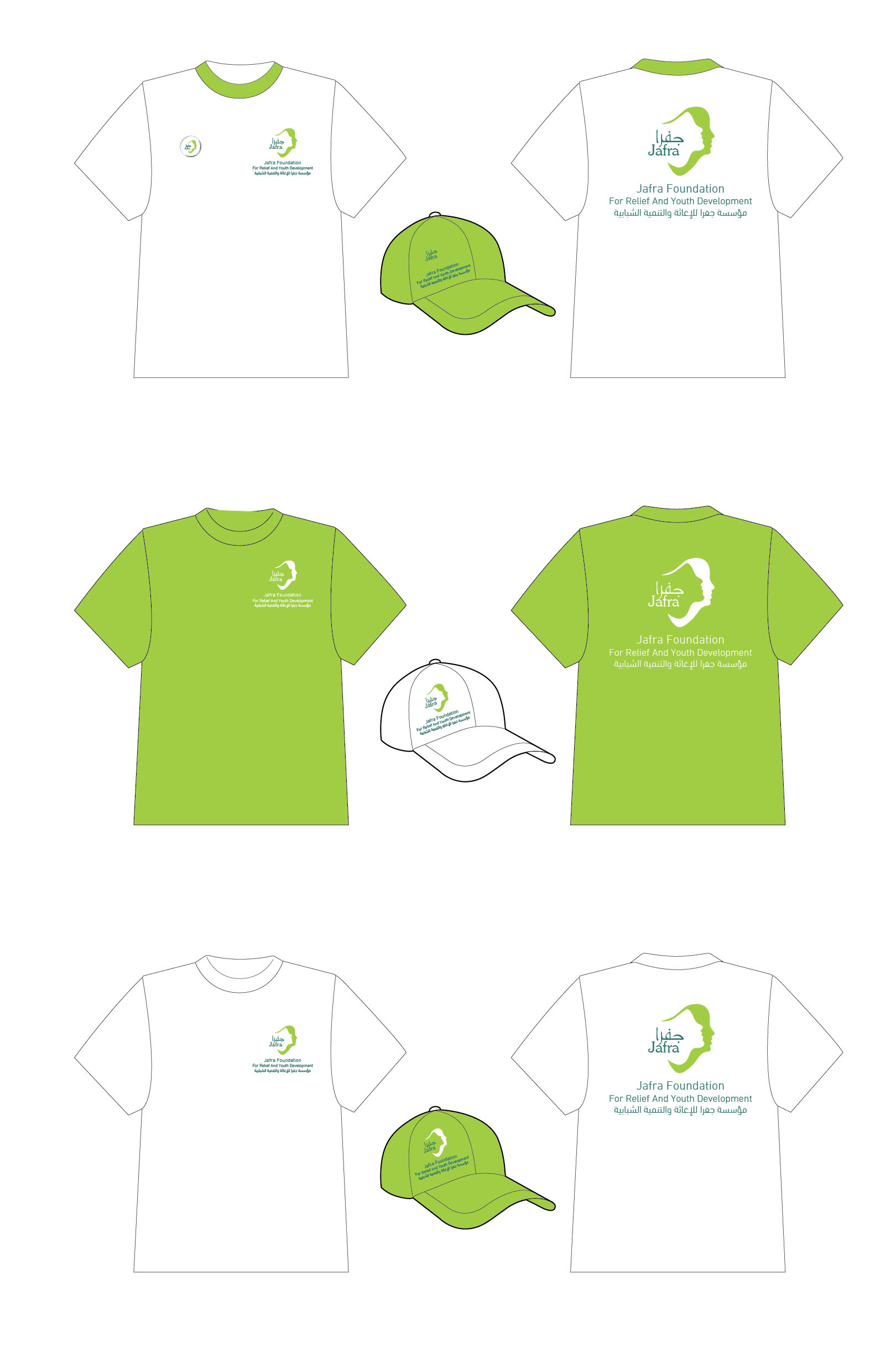
uniforme: Cap and T-Shirt
CD Stickers
Note
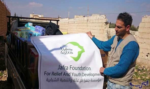
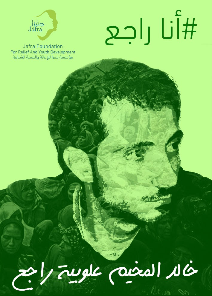
Posters
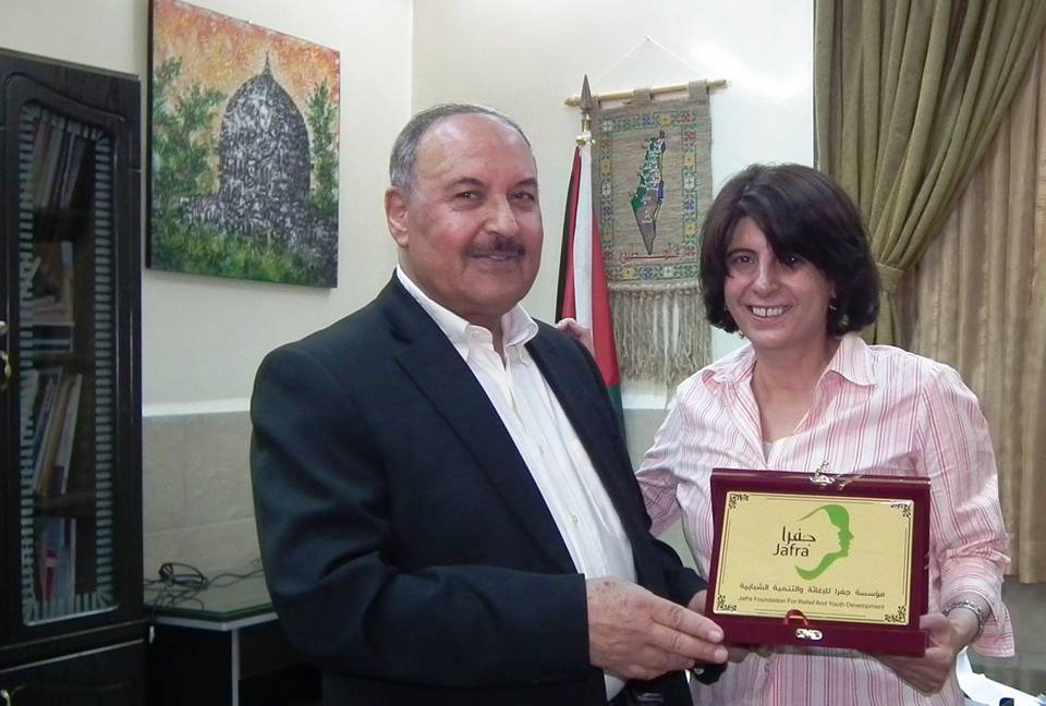
Honouring shield
Facebook cover design for the foundation page. They adobt the moto "We walk and we continue the way" from a famous arabic song.
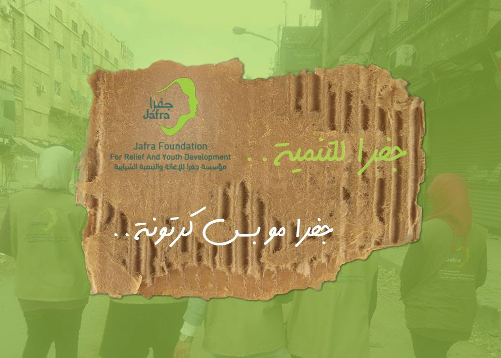
Ramadan greeting card
Poster Design
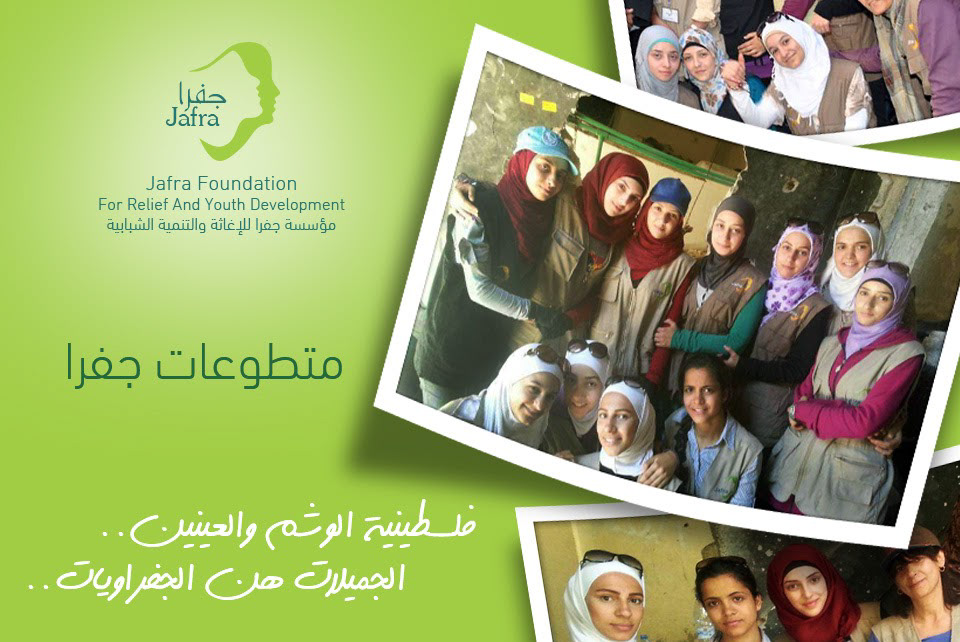
About the volunteers in Jafra foundation
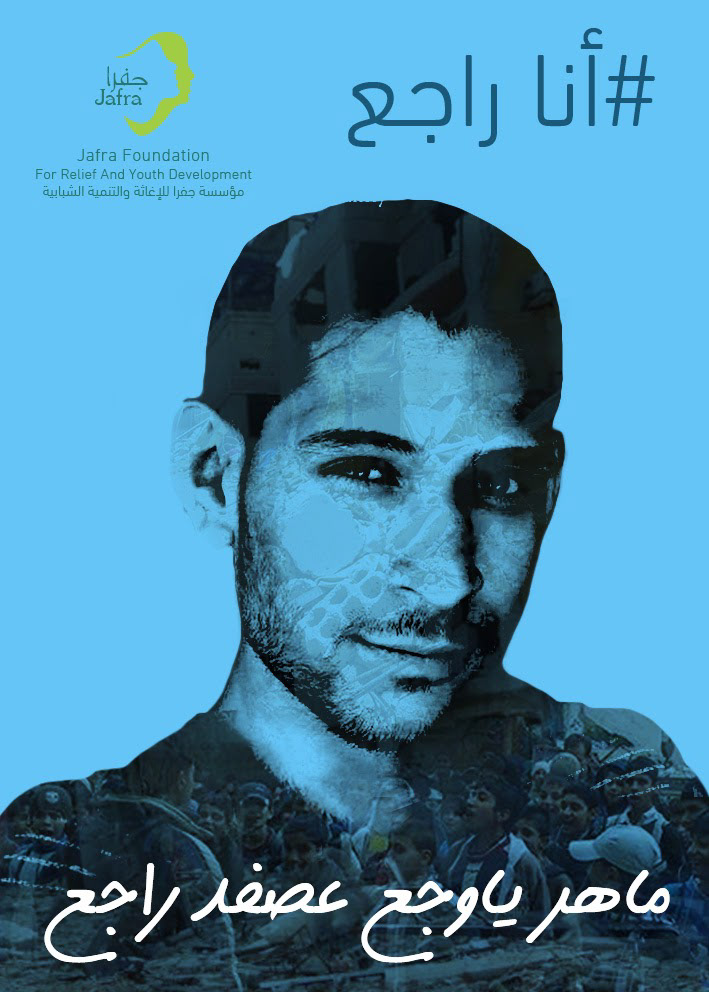
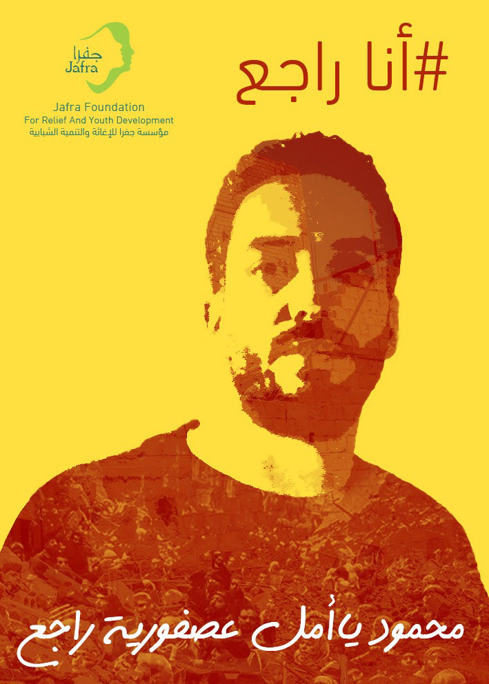
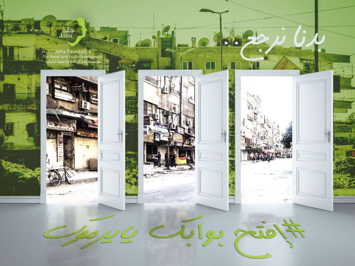
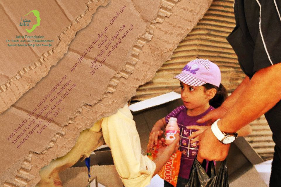
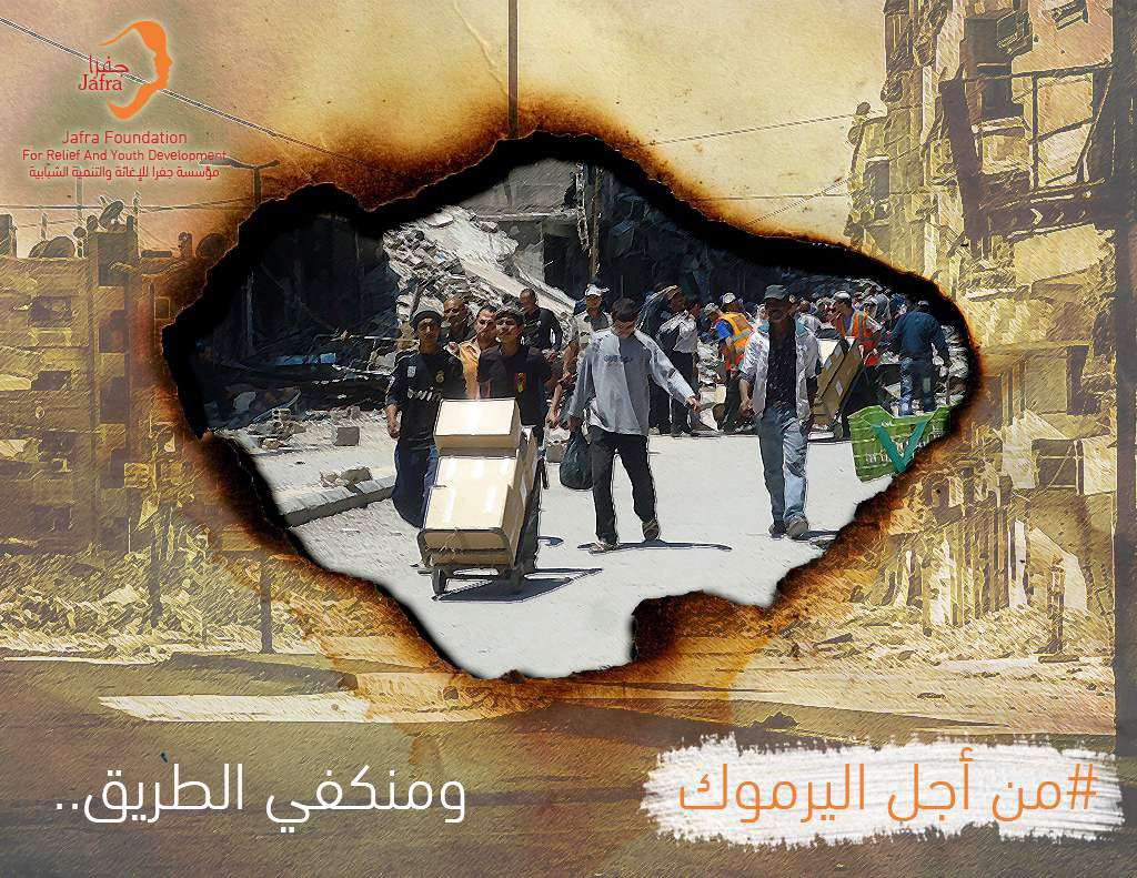
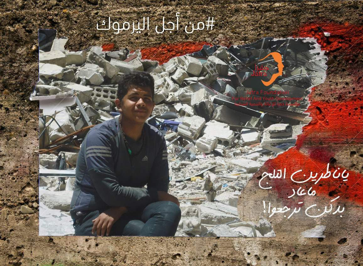
Social Media campaigns
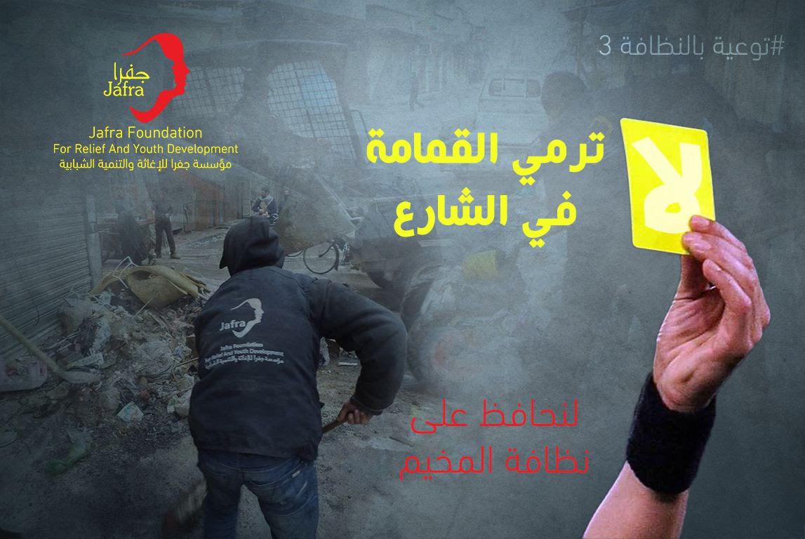
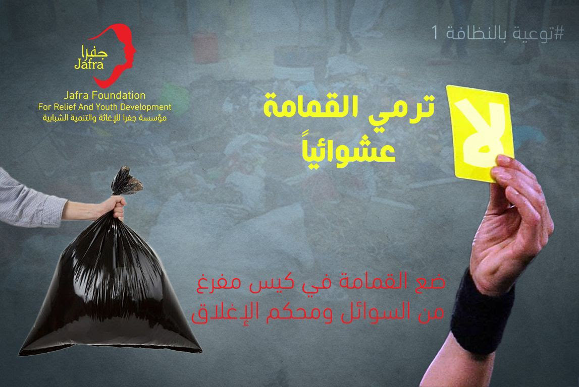
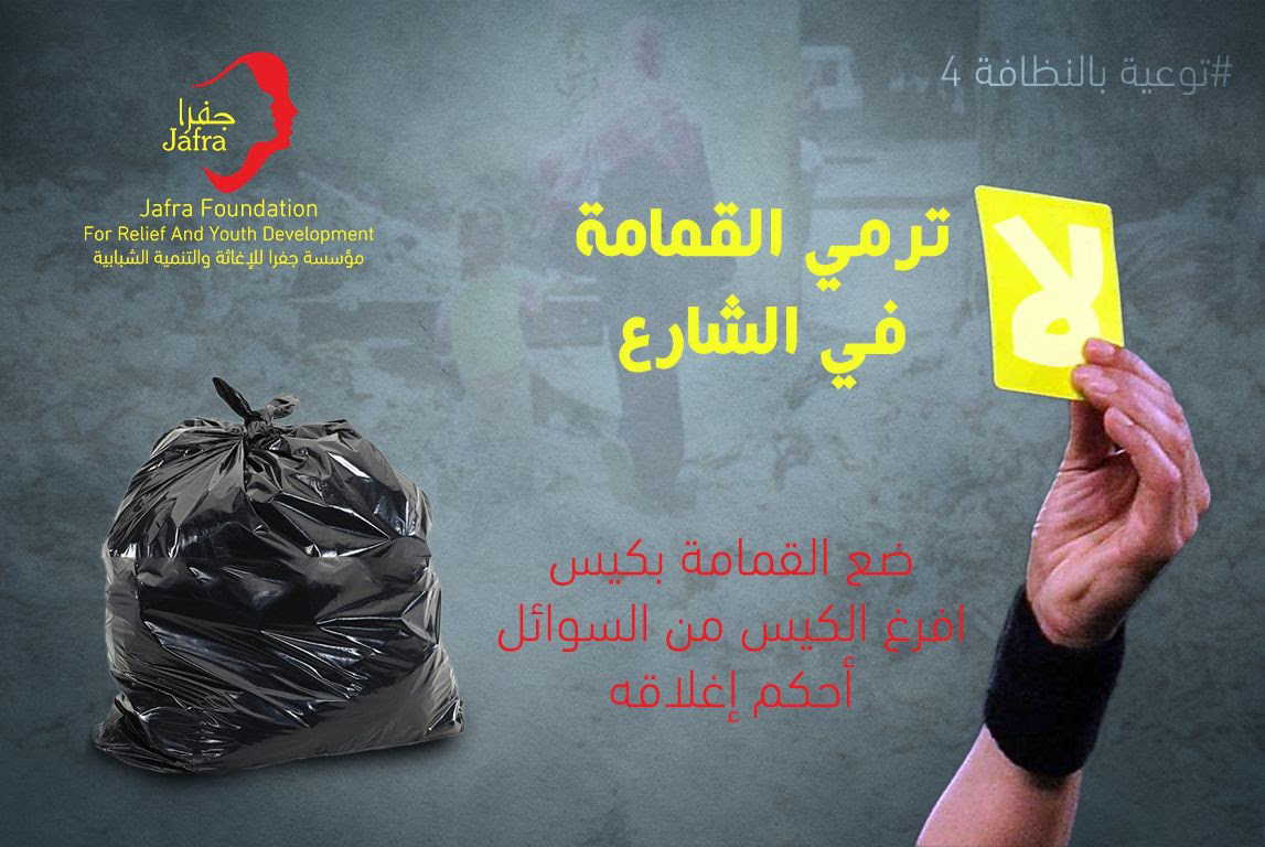
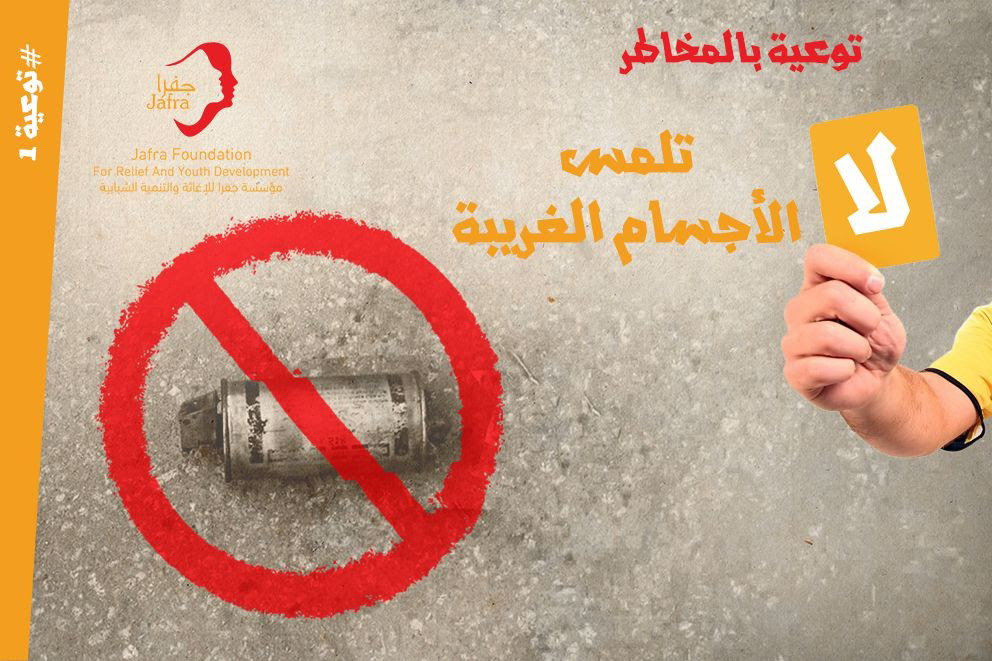
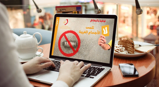
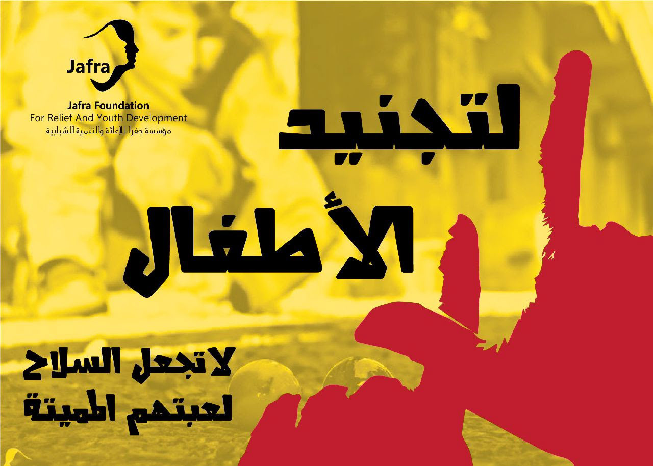
About awareness of bombs, children and waste
